END TO END MOBILE APPLICATION
TRAVEL
COMPANION
process
+
+
+
+
+
+
OVERVIEW
UX DESIGN COURSE
ROLE
UX/UI DESIGNER, VISUAL DESIGNER,
UX RESEARCHER
TEAM
SOLO
TOOLS
SKETCH, INVISION
DURATION
6 WEEKS
empathize
001
THE PROBLEM + GOAL
Currently there are a large amount of services and applications that help people with their travel experiences. The issue is this can be overwhelming for user's to plan and organize trip information, especially with other travelers. The design goal for this project is to improve peoples travel experiences by creating an application that allows for them to plan, organize, and share their trips.
research + discovery
002
RESEARCH GOALS
Before conducting user interviews, I established the target audience and created a comprehensive list of questions to help guide the interviews.

USER INTERVIEWS


AFFINITY MAPPING
After conducting interviews, I wrote down the key insights from the users on sticky notes. I then categorized them to establish overall themes and user goals.


define
003
PERSONA
After gaining insight from user interviews, I created the ideal persona, or user of the product. I focused on the behaviors and habits, scenarios and situations, and needs and goals of this persona to help guide my design decisions.

analysis
004
COMPETITIVE ANALYSIS
Once I researched competitive companies, I established the most relevant competitors to analyze their features. This process allowed me to determine what these existing companies were lacking and where I could improve the user’s experience.

FEATURE PRIORITIZATION
Based off the insight from my competitive analysis, I organized the potential features based on their impact and expectation to determine the minimum viable product.

solution
Travel Companion is an application that allows users to gain inspiration for travel destinations, plan and organize their itinerary, and share their trip with fellow travelers.
ideation + design
005
CARD SORTING
Once I established the features that were necessary, I had the previous user’s who I interviewed sort the features into categories and assign a name to each. After analyzing the outcome of user I was able to determine the main navigation features, and what sub-features will on each screen.


INFORMATION ARCHITECTURE
Prioritizing the features and conducting the card sorting activity allowed me to create a site map for the app. This map also includes the onboarding screens, and what actions can be taken on each screen.

USER FLOWS
The site map helped me determine the main screens and their features. I used this information to create the user flow through the app. I separated the flow’s between the onboarding experience and the main navigation of creating a new trip.

LO-FI WIREFRAMES + USABILITY TESTING
Below are sketches of the main screens based off the IA and user flows that I created. Based off of the user interviews, I focused on screens that user’s would benefit most from.

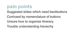
I contacted participants in the target demographic to conduct usability testing on my low fidelity wireframe. These tests were all done in person so I could observe the users. This helped me determine what was working well and what part of the design was confusing and needed to be redesigned. I’ve combined the final highlights and pain points below:

VS.

MED-FI WIREFRAMES
The usability testing allowed me to redesign the app to better fit the users needs. I focused on improving the highlights and completely rethinking the pain points for the users.

HI-FI WIREFRAMES
I conducted another round of usability testing on the medium fidelity wireframes to help me create the high fidelity wireframes below. These screens reflect how a new user would sign up for Travel Companion and start a new itinerary for a trip.


prototype
006
NEXT STEPS
Now that I've created a clickable prototype so users can experience what it would be like to create a trip, I am going to further develop other screens for the application.